| Element | Property | Color token |
|---|
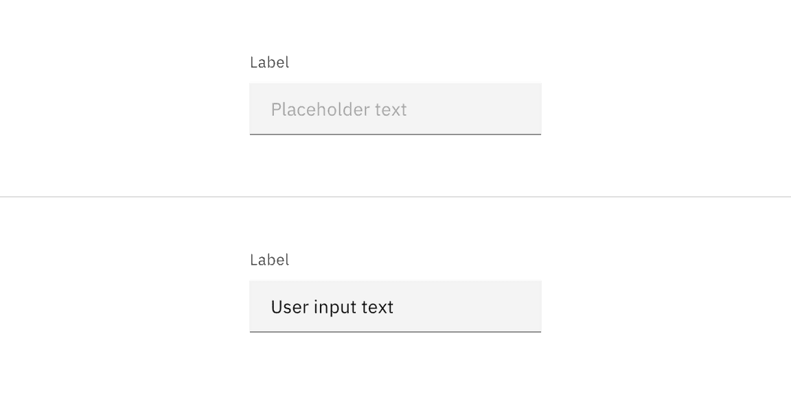
| Label | text color | $text-secondary |
| Field text | text color | $text-primary |
| Placeholder text | text color | $text-placeholder |
| Helper text | text color | $text-helper |
| Field | background-color | $field * |
| border-bottom | $border-strong * |
* Denotes a contextual color token that will change values based on the layer it is placed on.
| State | Element | Property | Color token |
|---|
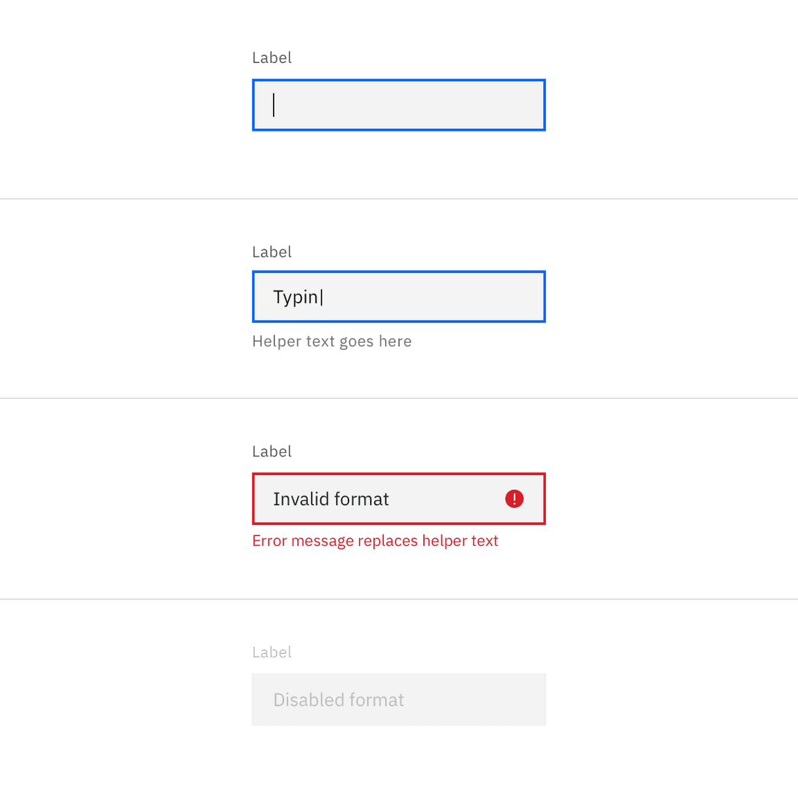
| Focus | Field | outline | $focus |
| Invalid | Field | outline | $support-error |
| Error message | text color | $text-error |
| Warning icon | svg | $support-error |
| Disabled | Field | background | $field * |
| Field | border-bottom | transparent |
| Field text | text color | $text-disabled |
Text input labels and placeholder text should be set in sentence case, with only
the first word in a phrase and any proper nouns capitalized. Text input labels
should be three words or less.
| Element | Font-size (px/rem) | Font-weight | Type token |
|---|
| Label | 12 / 0.75 | Regular / 400 | $label-01 |
| Field text | 14 / 0.875 | Regular / 400 | $body-compact-01 |
| Helper text | 12 / 0.75 | Regular / 400 | $helper-text-01 |
| Error message | 12 / 0.75 | Regular / 400 | $label-01 |
| Element | Property | px / rem | Spacing token |
|---|
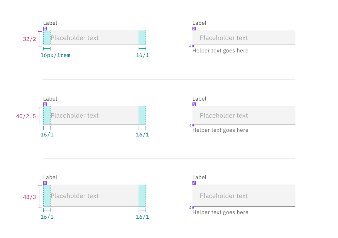
| Label | margin-bottom | 8 / 0.5 | $spacing-03 |
| Helper text | margin-top | 4 / 0.25 | $spacing-02 |
| Field text | padding-left, padding-right | 16 / 1 | $spacing-05 |
| Field | border-bottom | 1px | – |
| Field: focus | border | 2px | – |
Structure and spacing measurements for text input | px / rem
| Element | Property | px / rem | Spacing token |
|---|
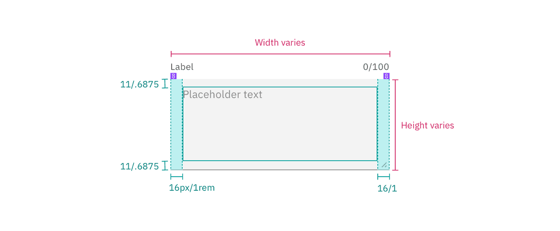
| Label | margin-bottom | 8 / 0.5 | $spacing-03 |
| Field | height | varies | – |
| padding-left, padding-right | 16 / 1 | $spacing-05 |
| padding-top, padding-bottom | 11 / 0.6875 | – |
| border-bottom | 1px | – |
| Field: focus | border | 2px | – |
| Helper text | margin-top | 4 / 0.25 | $spacing-02 |
Structure and spacing measurements for text area | px / rem
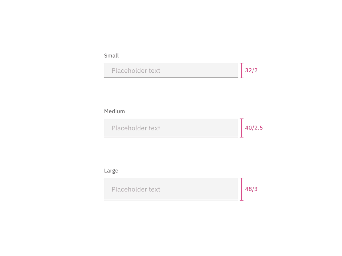
| Element | Size | Height (px / rem) |
|---|
| Input | Small (sm) | 32 / 2 |
| Medium (md) | 40 / 2.5 |
| Large (lg) | 48 / 3 |
Text input sizes | px / rem
